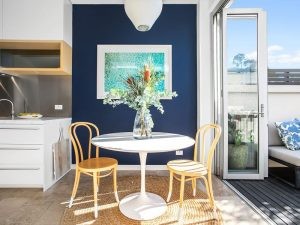
When it comes to Aussies and paint colours, it would appear there a few fast favourites that seem to pop up again and again. With certain areas of the country favouring particular hues.
It goes without saying that painting is one of the easiest and most cost-effective ways to instantly spruce up your home. Not only that, but a colour palette really can make or break the mood and ambience you’re trying to create in a space.
“Colour, in particular, can be incredibly influential when it comes to our emotions and state of mind,” says Djordje Dikic, CEO & Co-founder of Tint.
“Whether it’s a new coat of paint for the whole house or a simple feature wall to take one room from zero to hero — a fresh tint can go a long way. It also does wonders when it comes to adding value to the home.”
Tint is a direct-to-consumer paint company that uses some pretty nifty technology, called Pico, which digitises colour and enables users to measure, match, visualise, and be inspired by colour everywhere.
Djordje is director and co-founder of Palette, which developed the Pico tech. Using trend-driven insights that are captured via their Pico technology, Palette has curated a collection of 71 classic and on-trend hues.
Each month through Palette devices, more than 100,000 data points are collected relating to colours scanned around the globe.

It was actually the data and insights capture from Palette, that led Djordje and co-founder, Rocky Liang to launch Tint.
“Colour also has the ability to really tie a whole space together,” says Djordje.
Of course, we took the opportunity to get the inside scoop on what Australia’s favourite colour picks are across the states.
Australia’s most popular paint colours
In recent months, their most popular colours have been the aptly named “Inner Self”, a pale dusty green, and “Ol’ Blue Eyes”, a cool dusty blue.
“It seems now more than ever that people are keen to make their homes warm, calming and generally a nicer place to be,” says Djordje.
“It’s nice to see a lot of relaxing green-grey tones right across the east coast right now – who knew we had so much in common? Heading into the cooler months, we’re also noticing people moving towards greige (grey crossed with beige), dustier blues and darker olive colours.”
Here’s a breakdown of the colours across different cities:

Melbourne: Deep blue with a hint of green
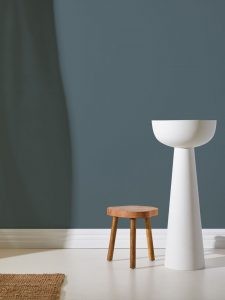
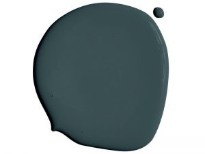
In Melbourne, dark blue with a hint of green “After Dark” has emerged as a favourite.
It could be that Melburnians are embracing the moodiness of iso, or their passion for dark coloured threads (AKA the Melbourne ‘uniform’). Whatever the reason, they’re not afraid to make a statement.

Sydney: Sandy beige
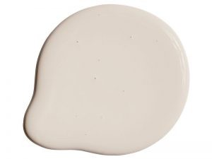
For Sydney, tastes are trending towards colours like “Fika” that are inspired by natural elements like sand, clay and the ocean – hues that are super easy on the eye at any time of year, these colours sit perfectly in natural light.

Brisbane: Light blue
As we know, not all of Australia gets particularly cold during the winter, so for somewhere further north like Brisbane, colour trends keep spaces light and bright.
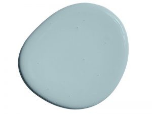
Cool greys and dusty blues like our ‘Ol Blue Eyes’, can provide a relaxed mood without getting too heavy.
Three tips for picking the right paint colour
Given that a good paint colour has the power to change the whole feeling of your home and up your resale value – without breaking the bank – we asked Djordje how to get it right so that your space shows off a little personality, style and ultimately makes a good impact.
1. Try before you buy
For those who want to see the colour on their wall before dipping their brush in, the Tint app has an augmented reality feature that lets you “try on” colours and see how it will look in your home and on your walls.
This is a great place to start if you’re not feeling quite ready to start putting paint on the walls but want to know how the end result will look.
2. Break colour up with trims
If you’re thinking of incorporating more pastels in your space, saturating a space in a colour you love can create a really cool sensory experience that might be just what you’re looking for.
If you’re wanting to keep it light but still use colour, consider keeping trims white to help break up the colour and keep it easy on the eye.
Bolder, brighter colours, on the other hand, can work especially well for feature walls, coloured archways or half walls.

3. You can do no wrong
We always say that the first rule of colour is there are no rules about colour. If you’re worried about choosing a “wrong” colour — don’t be.
Paint isn’t as permanent as you might think and at the end of the day, if you love a colour and it feels right in your home, then you should trust your instincts.
*Source: realestate.com.au
